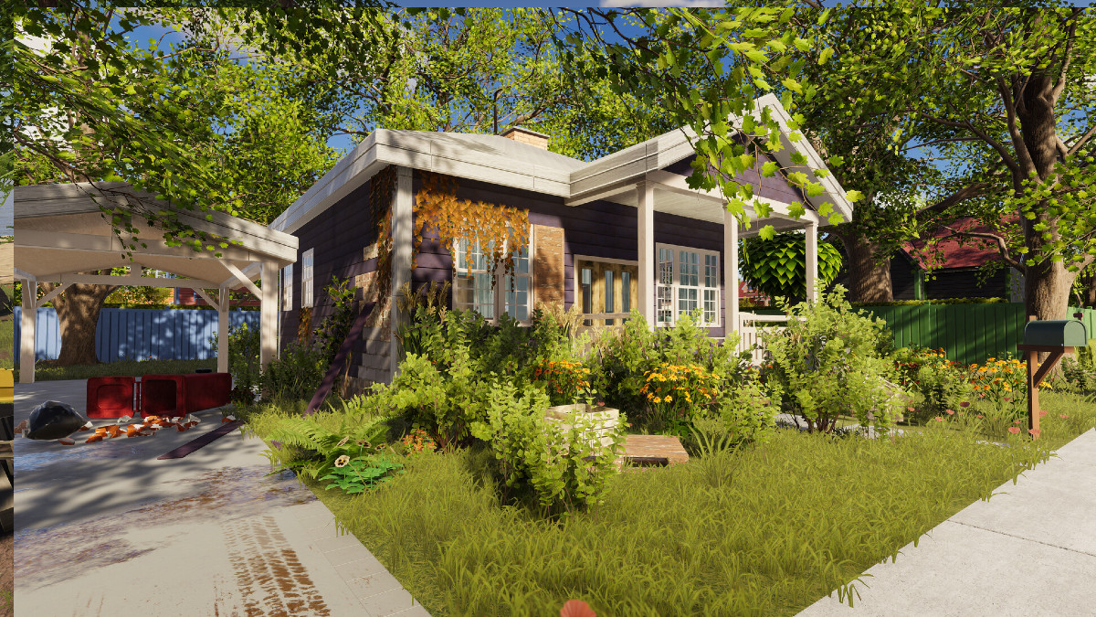
Over the past year, I’ve spent countless hours of my life watching my wife redecorate homes that she was able to purchase for pennies on the dollar in House Flipper. Watching her take a home from drab to fab was rather relaxing, and it inspired me to give the game a try.
While I may not have found myself as entranced by the options as she was, we were both beyond excited to give House Flipper 2 a go. While a few of the changes elongate the most tedious portions of the game, a solid foundation ensures that a great home can be built while still keeping true to the nature of the original.
Change is Somewhat Necessary
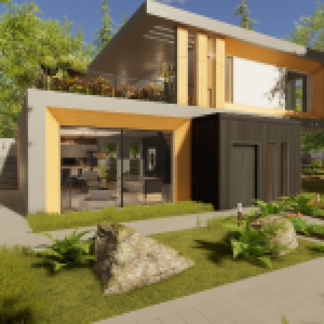

I’m going to be doing something a bit different for this review, as I’ll be including both my thoughts as a newer player to the franchise, alongside my wife’s thoughts about the additions, tweaks, and changes that have been brought to the table in House Flipper 2. While I’ve played enough of the first game to have a basic grasp of how the systems work, she’s the true expert here.
Before we dive into our dual-channel review, there are some things I’d like to point out first and foremost: playing on PC, House Flipper 2 is a much more graphically impressive game, with plenty of enhancements over the original title. Utilizing a new graphical style, House Flipper 2 borders between realism and animation, with a unique style that looks fantastic in motion. Objects are easier to see, thanks to what I like to call “Flipper Vision,” which can be activated with the press of a button to showcase what tasks need to be done next, much akin to other simulator games like PowerWash Simulator.
Many of the actions that you partook in within the walls of the first game have been completely revamped, with things such as painting and laying floor/wall tiling being much more in-depth. Gone are the days of selecting a few slats of wall to paint with your handy dandy paint brush, as you’ll now need to set borders and paint using either the mouse or Thumbsticks, depending on the control method you’ve chosen. Even tasks like placing tiles have been revamped, and gone are the days of installing every small piece of plumbing when you install a new piece of toiletry in the house of your dreams. While I know that was something I enjoyed doing, my wife is beyond glad to see some of the monotony gone.
It was also welcome to see how much more you got out of your typical items. In the previous game, even with the paint usage perks, it felt like you could hardly get enough done before you needed to buy a new bucket. Paint lasts much longer, tiles have many more in a box and are now also completely interchangeable. You no longer need wall tiles and floor tiles, you can use them wherever you like for unparalleled freedom of creativity.
Much like the original game, however, certain actions are still tied to upgrades and perks but are far more plentiful within the world of House Flipper 2. While painting is initially a chore, due to the small amount of surface area that is covered, a few perk unlocks will give you a paint roller that can expand in size to an almost comical amount, allowing you to get your walls painted in a timely and efficient manner. The general gameplay loop has been expanded and refined, even if some of the new choices do take some time to get used to.
For my wife, the most difficult part was coming from a fully leveled account with all of the upgrades to the starting floor once again. For those who have spent plenty of time within the world of House Flipper 1, there is going to be a period where things feel counterintuitive and cumbersome, especially due to the number of gameplay changes that have come in this sequel. As someone not fully engrained in the world of House Flipper, these changes did not bother me as much, but I could easily see how they could be cumbersome to players who have poured their hearts and souls into the first.
A Button Press Here and There
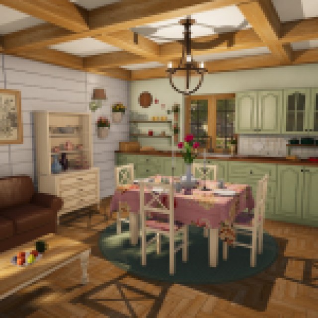
While watching each other play and seeing how everything worked, since I first gave my wife control of House Flipper 2, I instantly noticed that the general navigation of menus seemed to be a bit more tedious than the initial version. In the words of Mrs. Cichacki herself:
It’s a bit cumbersome to find things. While items like paint and tiling are easy to find, once you get into furniture and decorations, it can be a bit confusing. In House Flipper, everything was seperated in different tabs by the available rooms, where as now, it’s sepearated more by general item with a button press or two required to get into the general scape of the room. Before, I could find Living Room items in just a matter of moments. Now, I need to go into a seperate menu, select Living Room, save the choice, find the item, clear the filter, and return to that menu once again if I need something for another room.
And to that, I will agree wholeheartedly. Finding the perfect piece of furniture feels much more unwieldy, taking much longer than initially anticipated to find the perfect accessory that will match your living space. On the other side of the coin, however, the filters work wonders when trying to find the perfect stylistic choices that match your dream house. It’s a great example of a Catch-22, where one part of the experience has been unnecessarily altered while providing a great option at the other end of the field.
Customization has seen quite the revamp here, with patterns, colors, and the general look of objects leading the charge. Nearly everything with fabric can be altered, colors changed, patterns swapped, and more. This was a major plus, especially since customizing the look and feel of a home is rather important in a game about flipping houses. Do you want to stick with 70’s Chic? You can make it happen, and enjoy the results when your home hits the auction lot. Nearly everything in the game has received a much-needed revamp on the customization front, which means every home can look as unique as you could imagine. They did, however, get rid of the Vlad the Impaler picture, which was devastating to me, personally.
The general Quality of Life changes made to customization make House Flipper 2 a joy to experience, even with the more cumbersome menu navigation. The Color Dropper Perk makes matching the room exceptionally easy to use, and the Cloning tool makes grabbing a duplicate piece of furniture a breeze. Even cleaning and scrubbing becomes much more enjoyable as you watch the dirt disintegrate before your eyes.
As mentioned above, the initial hesitancy to how tiles, paint, and wallpaper work was originally disliked by both, but now enjoyed by both of us. It suddenly became much more fun after shedding the “fully-leveled account” feeling and seeing how painting worked with the unlockable Mega Roller. Even if putting up a paint border can be slightly obnoxious at times, that can even be removed in the future. The more time you put into House Flipper 2, the more you’re rewarded for it. I strongly suggest giving it time as it will take some getting used to, but after returning to the first game, this change feels like an improvement and gives the motions of actually putting the time into the home rather than it being a video game.
You’ll also need to take on several side jobs before you can start putting big money into your flippable properties. The original game handed out money like it was going out of style. Still, it seems that House Flipper 2 has unfortunately been affected by inflation as well since it takes more time to furnish a house before you can finally sell it fully. You also need to do plenty of tutorials that teach you about how the game functions before you can even start working on your first property, which to someone like myself was nice, but veterans may feel it unnecessary. Don’t expect to jump in and start earning hundreds of thousands of dollars off the bat, we needed to put in the work to see the results.
It does seem, however, that the decor that is placed inside finally has an actual impact on the amount of money we earn from flipping houses. As a test, we barely furnished one home and went all out on another, and it seems our efforts were rewarded. It’s still not as much cash as we were making in House Flipper, but it’s good to see that the decoration that you pick may finally have a purpose.
Sandbox Mode Needs Some Extra Polish
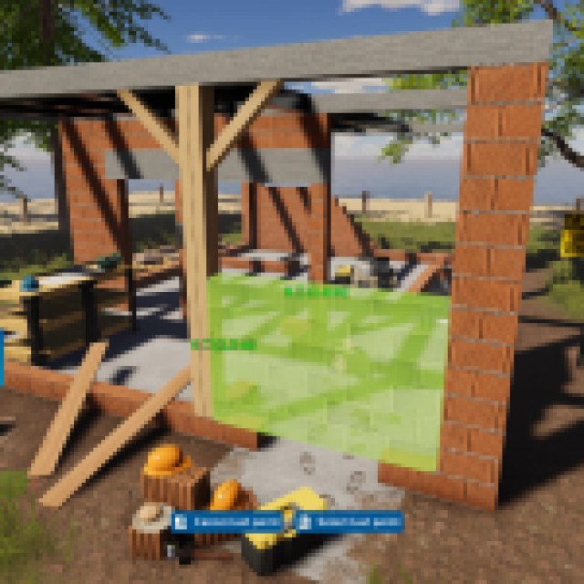
Let’s say you get bored of working on the homes that are available to you, and you want to see if you’ve got the skills to pay the bills. The newly introduced Sandbox mode offers this challenge directly up to us, allowing us to create the home of our dreams and the tasks that would follow suit. You see, not only could we create the home, but we could also create the tasks that needed to be done to ensure that it’s fully up to snuff.
This mode sounds incredible on paper and gives players something tremendous to look forward to. In practice, however, we found it to be rather buggy, confusing, and, at this point, incomplete. For example, there is an option to make your character “fly” while using the Sandbox mode, much like in games like Minecraft when playing in Creative mode. This allowed us to try and place a proper roof over our heads, and place some more intricate items in higher locations. However, more often than not, we would find ourselves falling through the Earth below our feet, plummeting into a horrifying pixel Hellscape. It was the furthest thing from relaxing, as it was rather infuriating.
The lack of direction was also disappointing, as the Sandbox mode could have used a proper tutorial. Yes, the game does direct you to check out how Sandbox mode works via their YouTube channel, something that we did, but a direct tutorial available in the game would have been much further appreciated. Show players how to use the tools and direct us in the right direction rather than pushing us to go on YouTube and watch how things are done. Even implementing a menu that lets you view videos directly from the game would have been a more welcome option than needing to exit the game to watch YouTube videos on how to play.
With some extra polish, however, I can see the potential of what the team at Frozen District is aiming for. The possibilities could be endless, especially with incredibly creative players getting their hands on the tools that are presented. At this point, however, it feels clumsy and slightly tedious to get anything figured out, and I can only assume that many players will feel the same way once they finally get their hands on this part of the program.
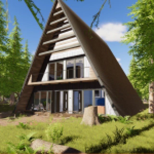
There is a strong foundation when it comes to House Flipper 2, even if some of the concrete used in the basement is a little lumpy. While it took some time for us to get used to the overall changes, they slowly became welcomed within our playstyles and slowly started to show their true values. Even after our original gripes, it slowly became apparent that House Flipper 2 is just as much fun, if not more so, than its original form.
While Sandbox mode has a way to go before it is up to par with the rest of the package on show here, House Flipper 2 is a welcome addition. New jobs, new houses, and so much to do once you’re inside of them, this is one of those games that you can lose countless hours of your life to without even realizing it. Now, if you’ll excuse me, I need to go touch up some of the paint on the back wall over there.
House Flipper 2
There is a strong foundation when it comes to House Flipper 2, even if some of the concrete used in the basement is a little lumpy. While it took some time for us to get used to the overall changes, they slowly became welcomed within our playstyles and slowly started to show their true values. Even after the original gripes we had, it slowly became apparent that House Flipper 2 is just as much fun, if not more so, than its original form.
Pros
- Customization is top notch.
- Most changes to gameplay are an improvement.
Cons
- Sandbox mode is very rough in it's current state.
- More menu navigation than is realistically needed.
- Some changes are much more tedious than the original.
A copy of this game was provided by the publisher for review. Reviewed on PC.

